Built hot.
Made to last.
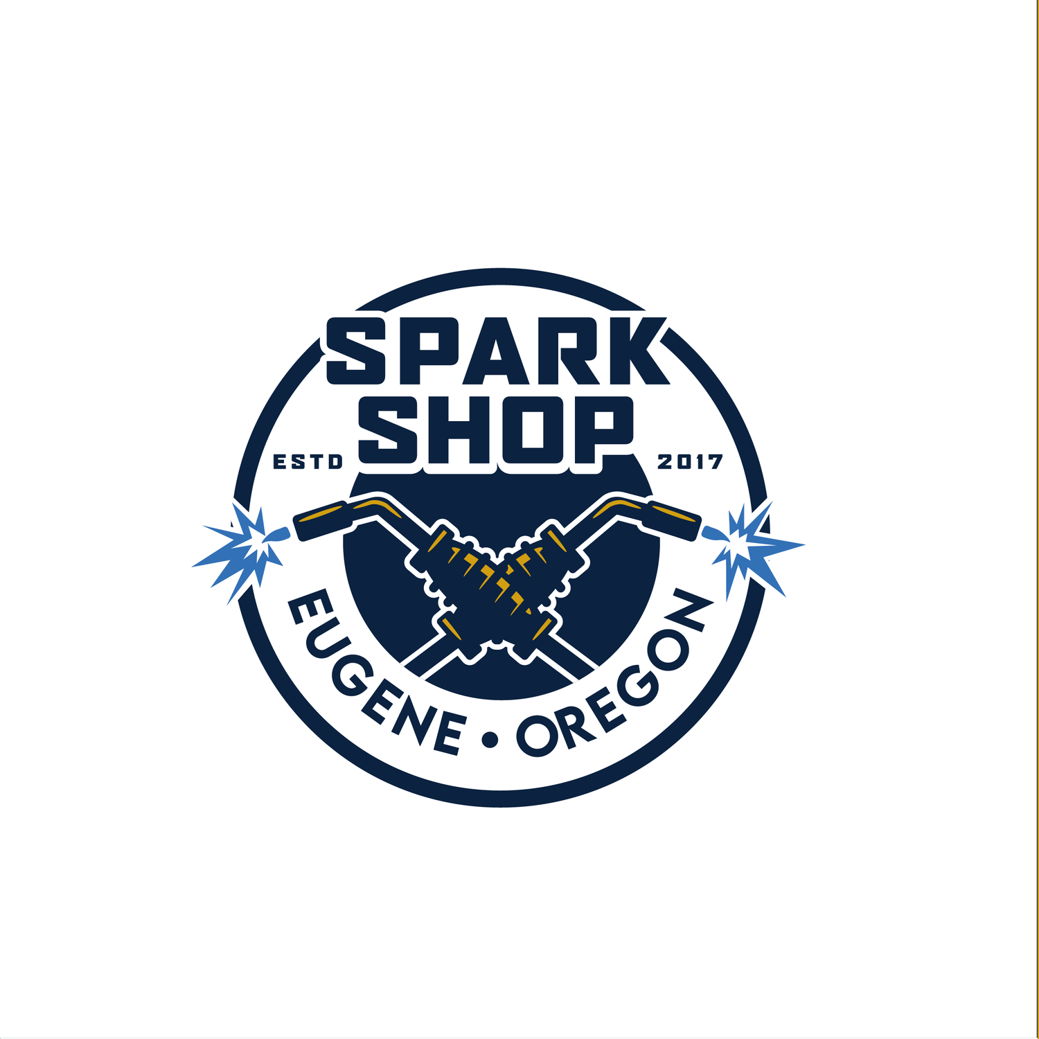
I designed the identity for Spark Shop in Eugene, Oregon: a hard-working badge built around crossed torches and a shower of blue sparks.
Concept development
Brand identity
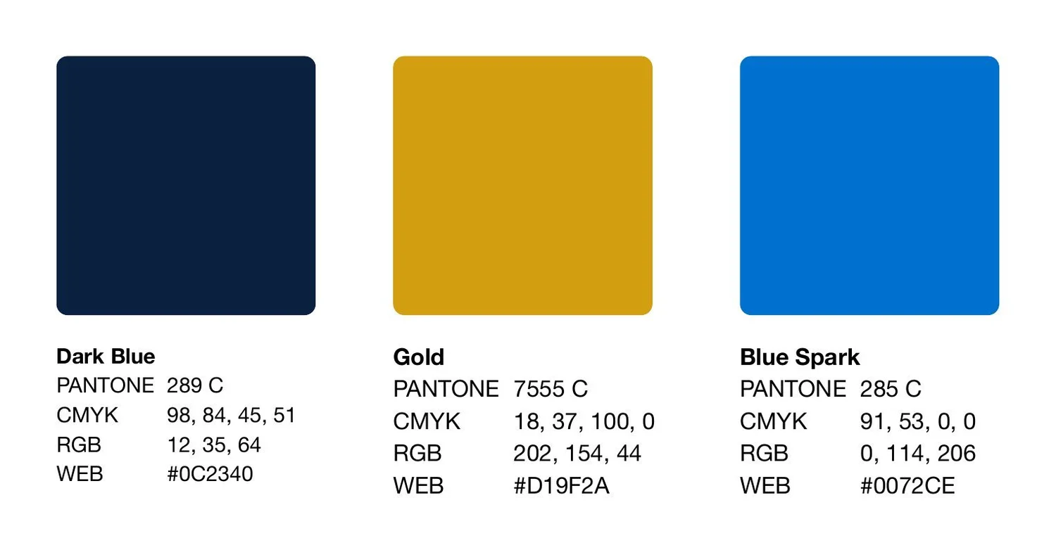
Color palette
Strike an arc.
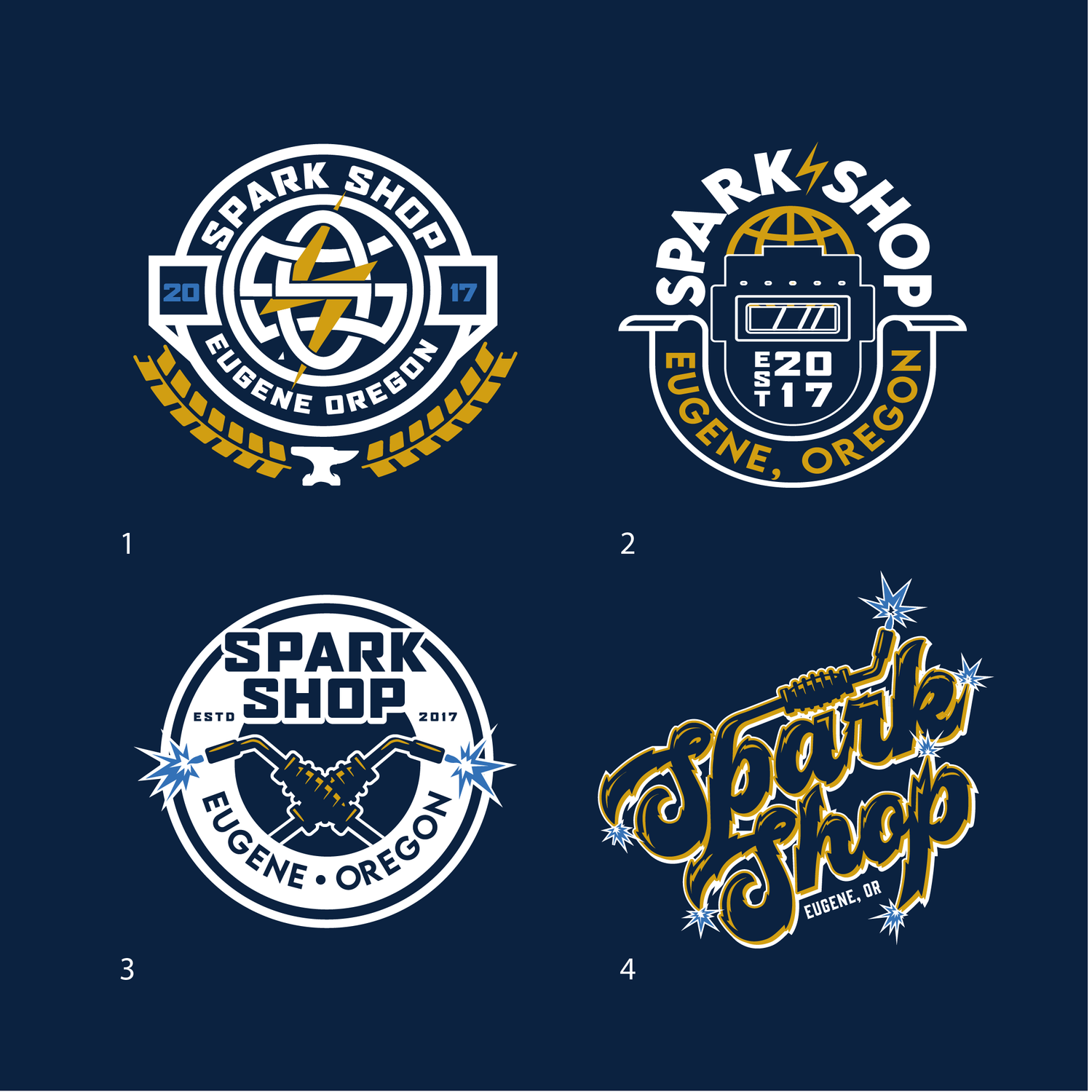
The brand needed to feel like the work itself: heavy, precise and a little bit electric. I explored four directions, from a collegiate crest to a hand-lettered script, before landing on a round badge with two crossed torches throwing sparks at either side.
From the badge I built a small system: a stacked mark, a horizontal lockup for signage and a three-color palette of dark blue, gold and a bright spark blue.
Four ways
to strike.
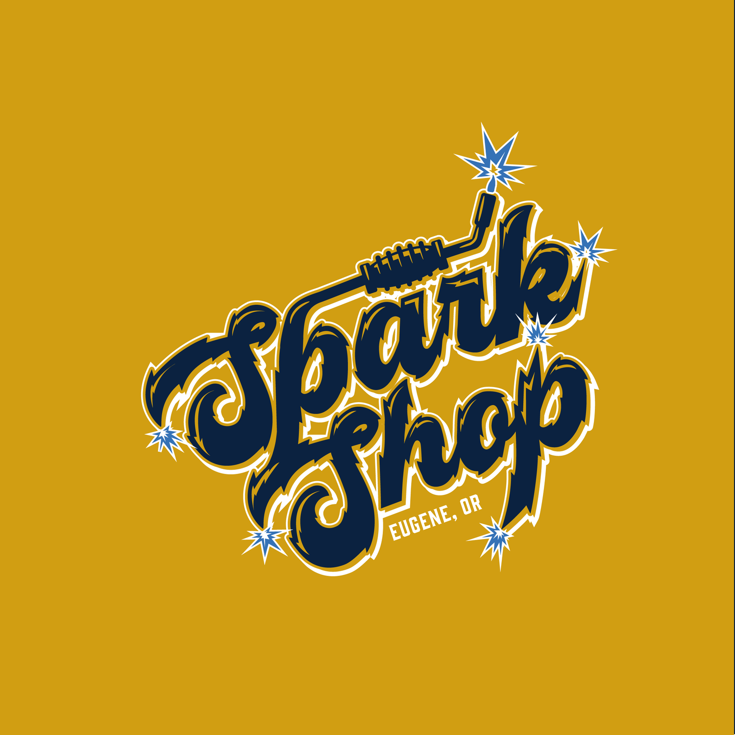
The exploration covered a crest with an anvil and wheat, a vintage welder’s helmet badge, the crossed-torch badge and a sparking script. The torch badge won out for its strong silhouette and clear story.

One badge,
every size.
The final badge breaks down into a stacked mark and a horizontal lockup, so the brand holds up on everything from a shirt to the sign over the door.