Strong mark.
Clear path.
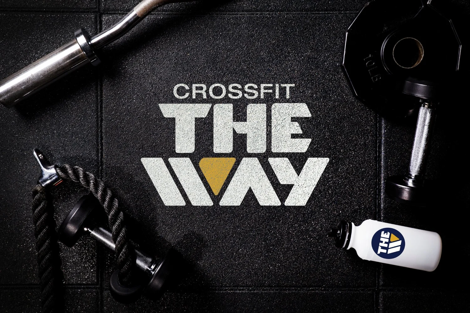
I designed the identity for CrossFit The Way, building a bold, athletic mark that reads from across the gym floor and holds up on everything from mats to the shirts coaches wear.
Brand identity
Color palette
Brand guidelines
Built for
the box.
A CrossFit gym runs on community and grit, and the brand needed to feel like both. The wordmark stacks THE over WAY in heavy, athletic type, with a gold chevron set into the W so the name itself becomes the symbol.
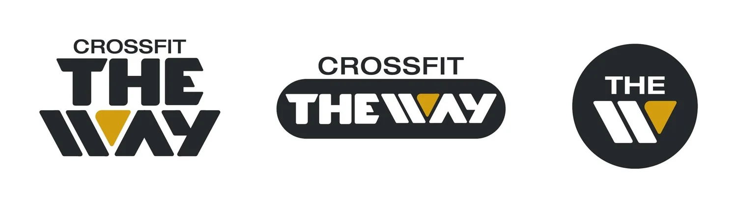
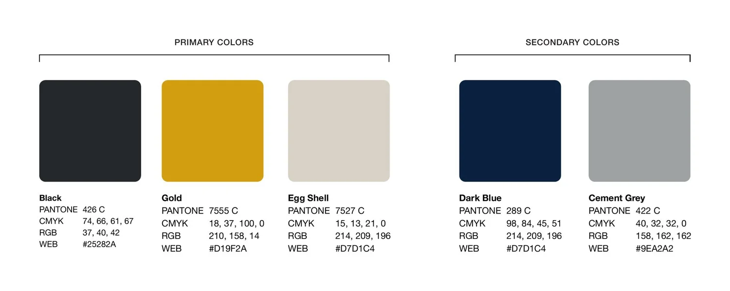
From there I built a small, hard-working system: a stacked primary logo, a horizontal lockup, a round badge and a palette anchored in black and gold, all documented in a brand guide so the gym can apply it consistently.
One mark,
three ways.
The system includes a stacked primary logo, a horizontal pill lockup for apparel and signage, and a circular badge for social and small spaces. All three share the gold chevron, so the brand stays recognizable at any size.
Made to be
worn and used.
The identity was built for a working gym: knocked out in white on black rubber flooring, printed on gear and worn by the coaches who run the floor.