Setting the tone.
Season after season.
At Quiksilver, I set the conceptual and stylistic direction for tees and hats, and oversaw every level of production for Quiksilver Edition.

Quiksilver Edition production
Seasonal bodies & themes
Trend forecasting
Direction from
concept to print.
I established the conceptual and stylistic direction for Quiksilver’s tees and hats, created new bodies and themes each season, and researched and analyzed the market for trend forecasting.
I also helped shape the story for the entire Quiksilver Edition line and oversaw it through every level of production, collaborating with production artists, photographers, illustrators, prepress technicians and printers along the way.
Working the icon.
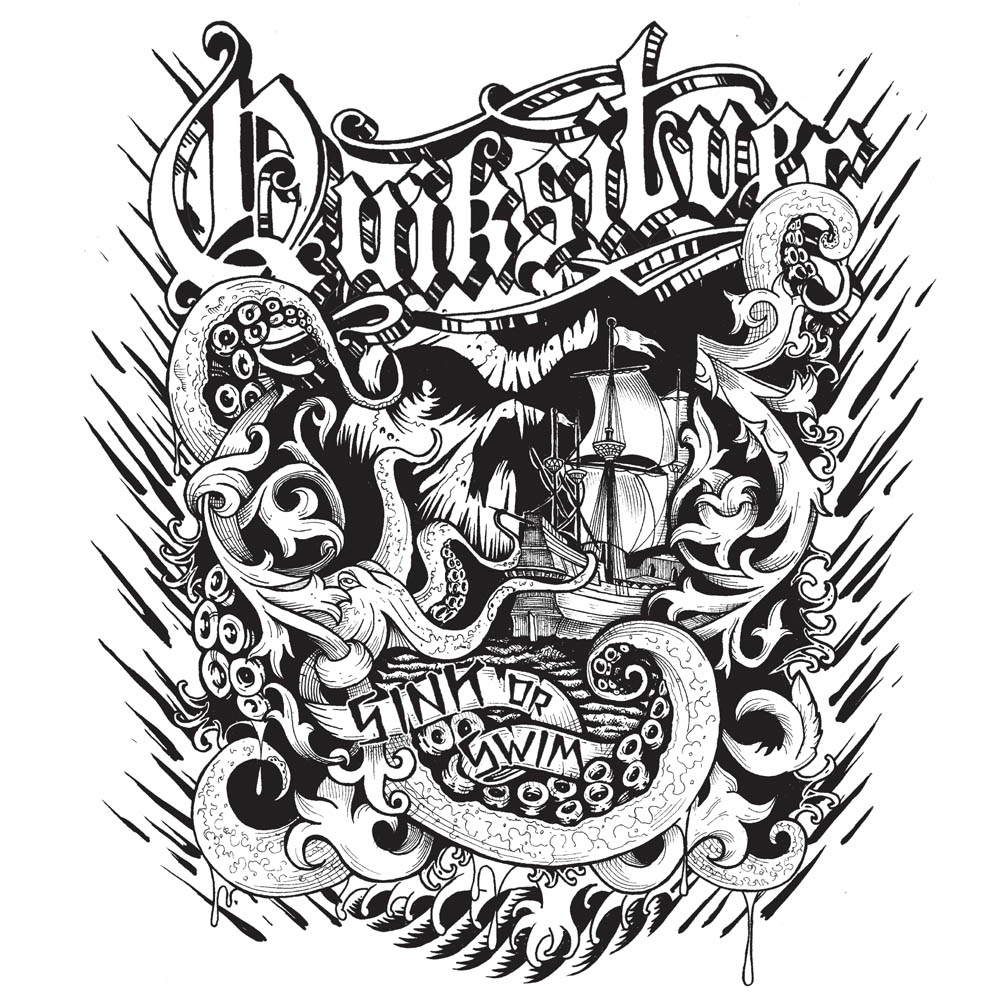
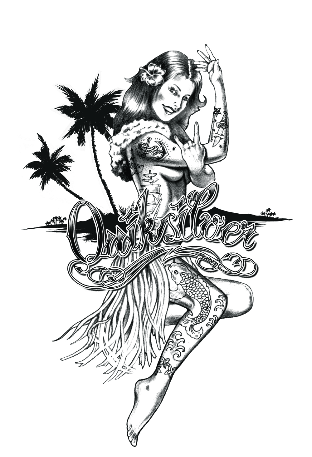
Lettering, emblems and logo treatments that gave the Quiksilver mark new energy from season to season.


Character on cotton.
Illustrated tee graphics built on the brand’s surf roots, from bold logo-driven pieces to detailed, story-led artwork.




Pattern in every panel.
Allover prints that carried the brand’s graphic language across the full garment.


