BREAD STOP / BRAND IDENTITY & PACKAGING
Made with
character.
A recognizable identity and a connected packaging family for a Eugene bakery.
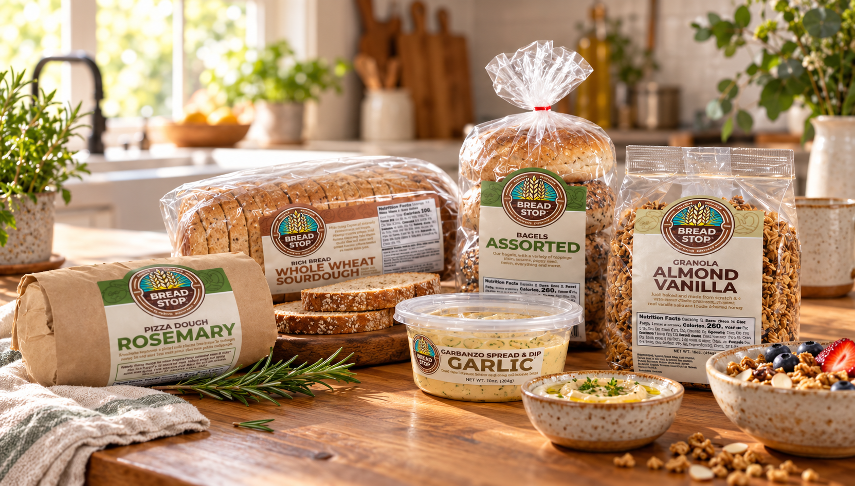
The family / Bread Stop in everyday life
THE PROJECT
BRAND
Bread Stop
Eugene, Oregon
FEATURED WORK
Brand identity
Packaging & label design
Hand-drawn illustration
Different products.
One familiar face.
The wheat emblem anchors a visual system built around warm colors, clear product names, and hand-drawn food illustrations. Across different products and package formats, a shared identity keeps the family connected.
01 / The identity
Rooted in the ingredients.
The Bread Stop identity pairs a hand-drawn wheat emblem with expressive lettering, giving the brand a warm, approachable character. Its circular form creates a recognizable signature across the product family.
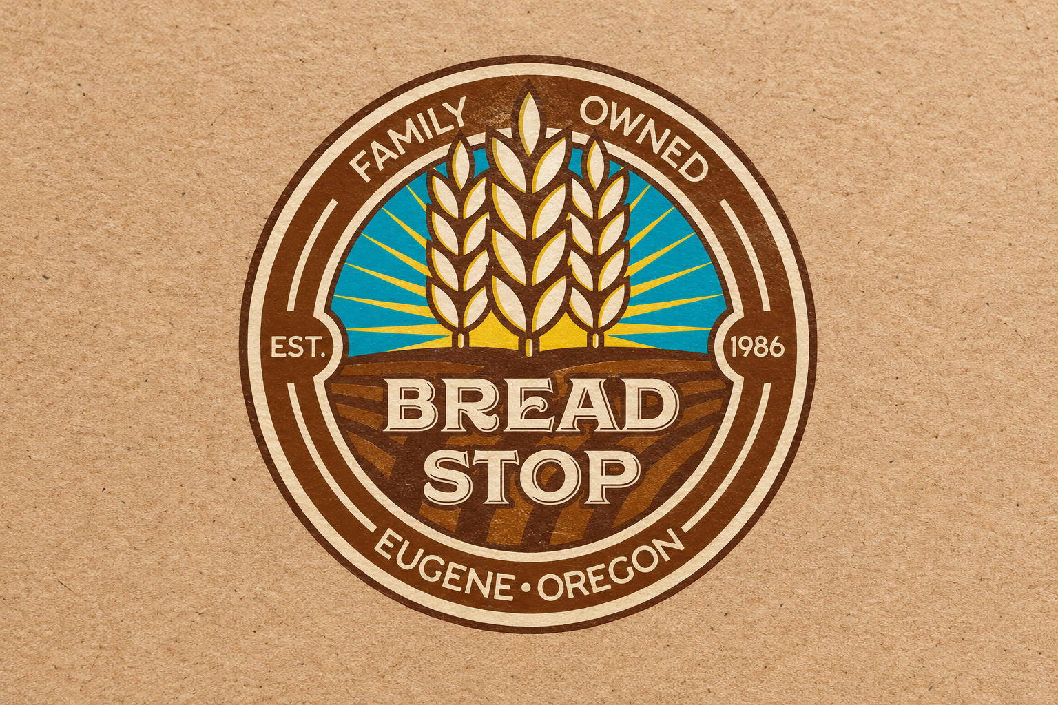
Full-color Bread Stop logo.

Black-and-white logo variations.
02 / The packaging
A family with variety.
Hand-drawn illustrations of breads, rolls, and bagels extend that character into the packaging, connecting each label to the craft of baking. A coordinated color system helps distinguish varieties and makes the collection easier to navigate. Together, the illustrations, color, and consistent label structure give each product its own identity while keeping the Bread Stop family connected.


The vertical label assortment.
The horizontal sandwich-bread label assortment.
03 / THE ILLUSTRATION
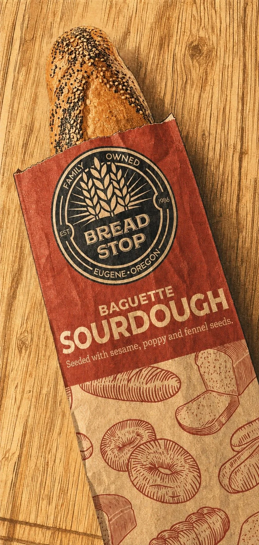
illustration in use / Sourdough baguette packaging
A little human touch.
Drawn from
the bakery.
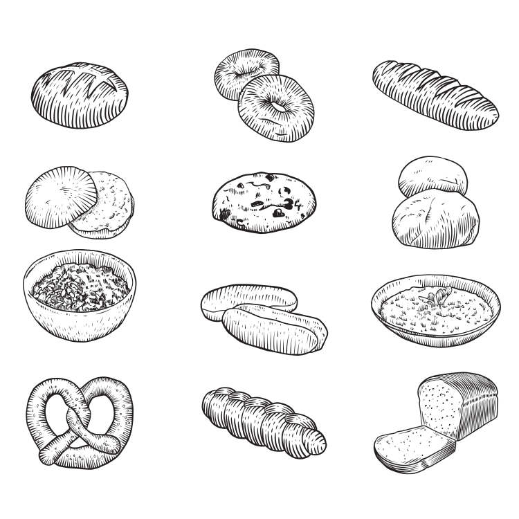
Loose linework adds texture and warmth to the system. Hand-drawn loaves, rolls, and bagels become a repeating pattern on the package, carrying the character of the bakery beyond the label.
The artwork / A library of baked goods