GLORYBEE / PACKAGING DESIGN
A color for
every flavor.
A new packaging system for GloryBee, with a distinct color code for every honey’s flavor profile. Created with the team at Revolution Design Group.
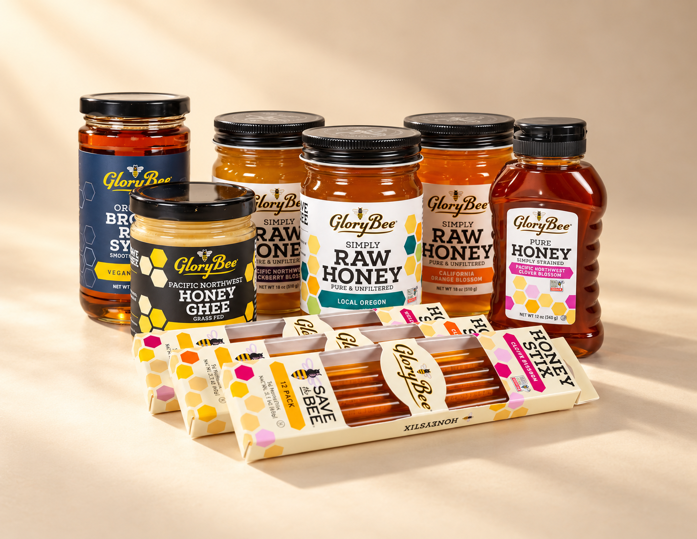
The collection / A connected packaging family
THE PROJECT
BRAND
GloryBee
MY CONTRIBUTION
Packaging system design
Label design
COLLABORATION
Revolution Design Group
Distinct flavors.
One family.
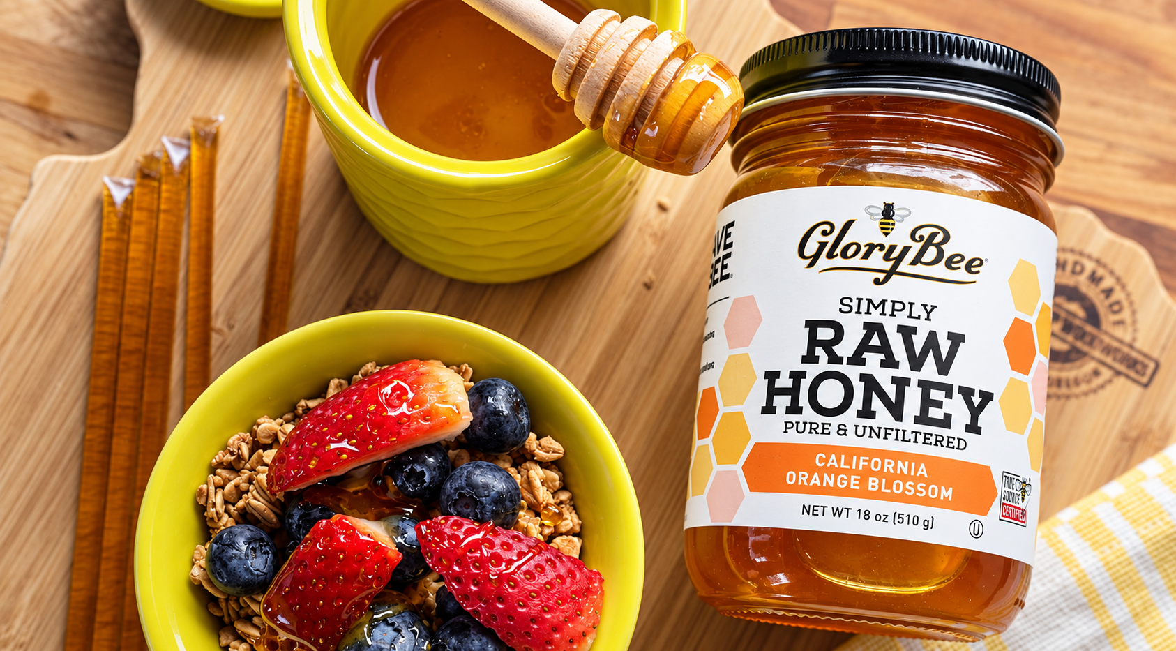
While at Revolution Design Group, I helped design a new packaging system for GloryBee. Each honey was assigned a specific color code tied to its flavor profile, giving individual varieties a distinct identity within a consistent product family. The packaging can still be found on store shelves today.
01 / PACKAGING SYSTEM
The family. The details.
The product range and a closer look at the label show how typography, color, and information work together across the packaging.


The range / A consistent family of labels
A shared framework.
The GloryBee mark, prominent product name, and repeating honeycomb shapes connect each jar to the broader range.
A shared framework.
Room for distinction.
Each color code identifies a specific honey flavor profile, distinguishing the varieties while preserving a consistent layout across the range.
The packaging / Out in everyday life
02 / Beyond the package
A bigger brand presence.
Trade show graphics carry the packaging’s visual language into a physical space, bringing product presentation, brand messaging, and the honey story together.

Trade show / Product presentation & messaging

Trade show / A connected environment