Raised right.
Branded to match.
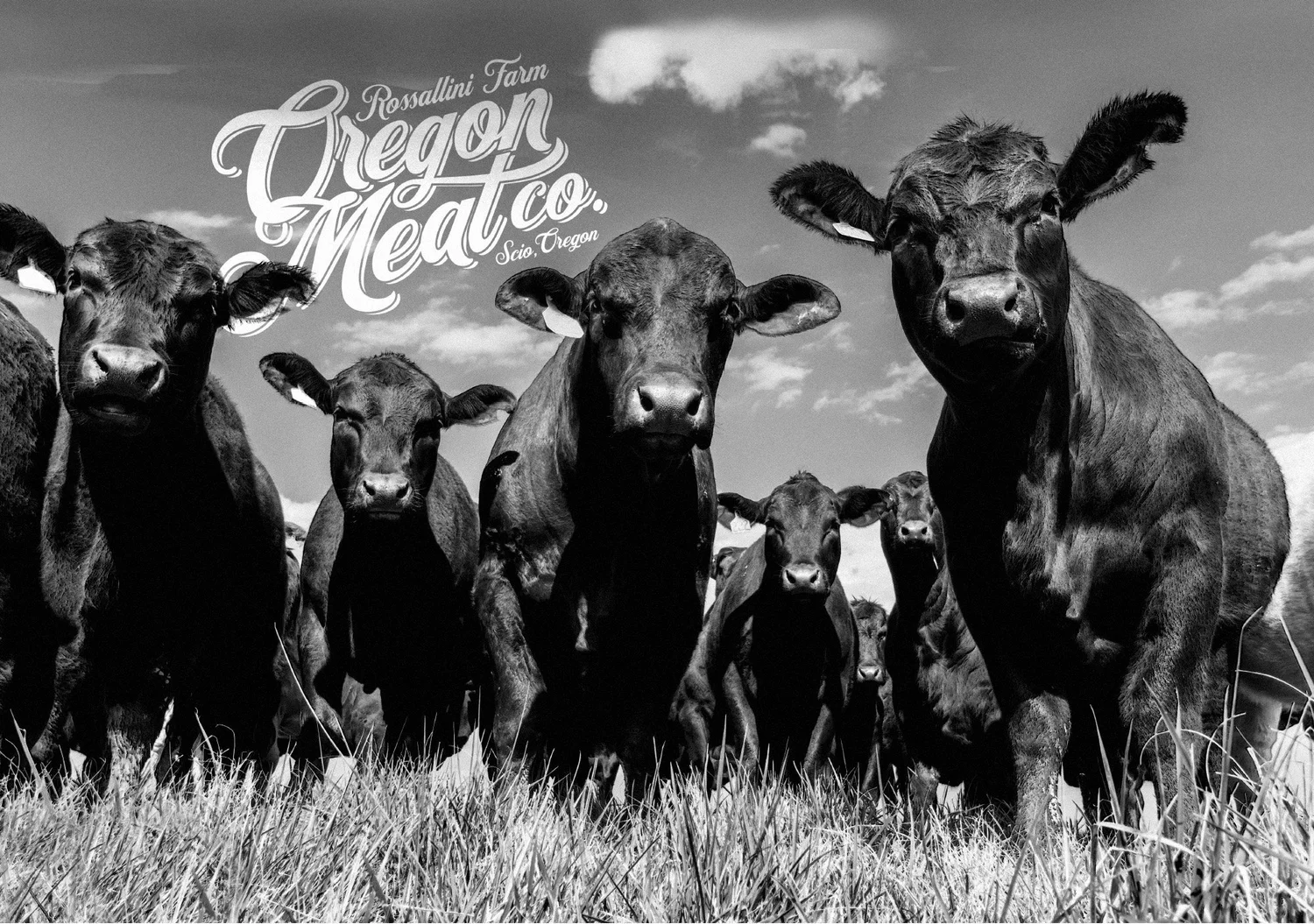
I led the identity and packaging for Oregon Meat Co., a small pastured livestock and poultry farm in the Willamette Valley, giving its meat a look as honest and well-made as the way it’s raised.
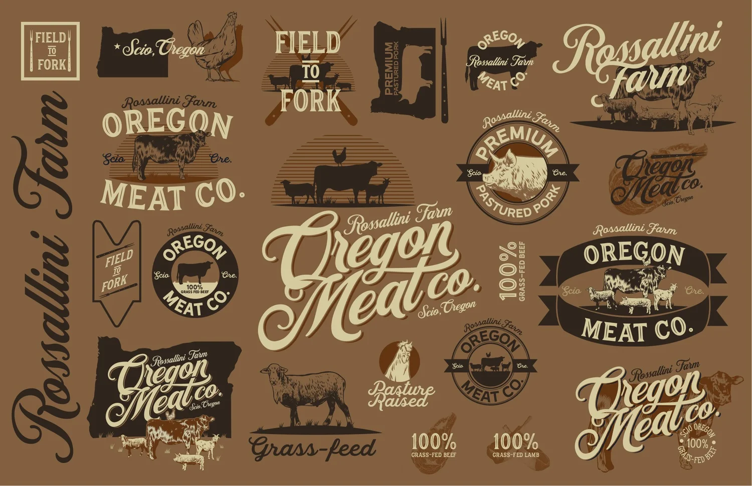
Logo development
Brand guidelines
Livestock illustration
Packaging designSTUDIOManifest Creative, with Wade Long
Small farm.
Serious standards.
Just outside Scio, Oregon, the farm raises pork, lamb, goat, chicken and rabbit on pasture and sells direct to its community. The meat was premium; the packaging and print materials didn’t say so. They needed an identity that could stand up next to bigger brands without losing what made them local.
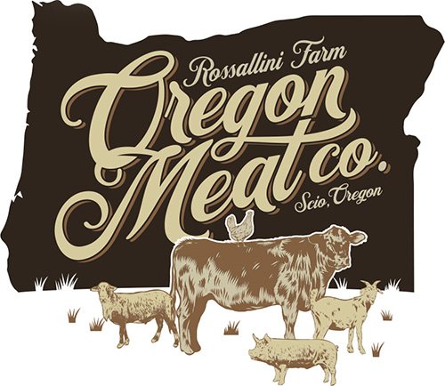
The answer was to put the farm’s own animals at the center of the brand. Classic, hand-drawn iconography carries from the logo through illustrations, guidelines and labels, so every piece tells the same story: real animals, raised with care, a few miles from where you buy them.
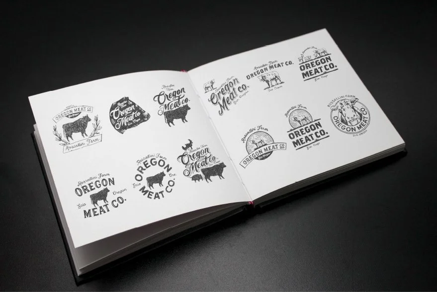
It started with a pencil.
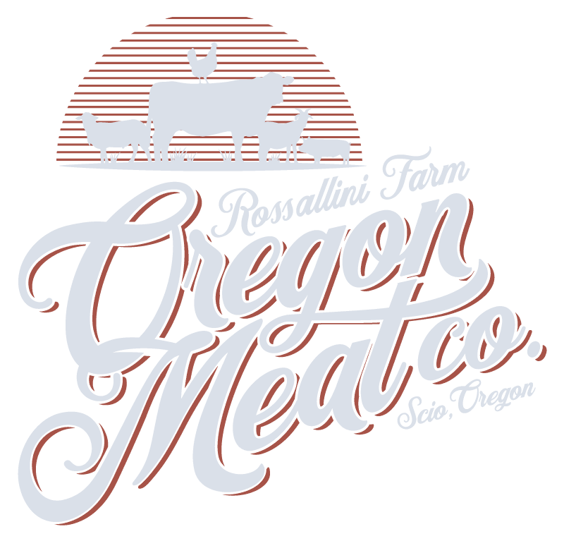
Every identity I lead begins with sketches. For Oregon Meat Co., that meant exploring classic farm and butcher-shop iconography alongside the specific livestock the farm raises, then refining the strongest direction into a primary mark and a family of supporting lockups.
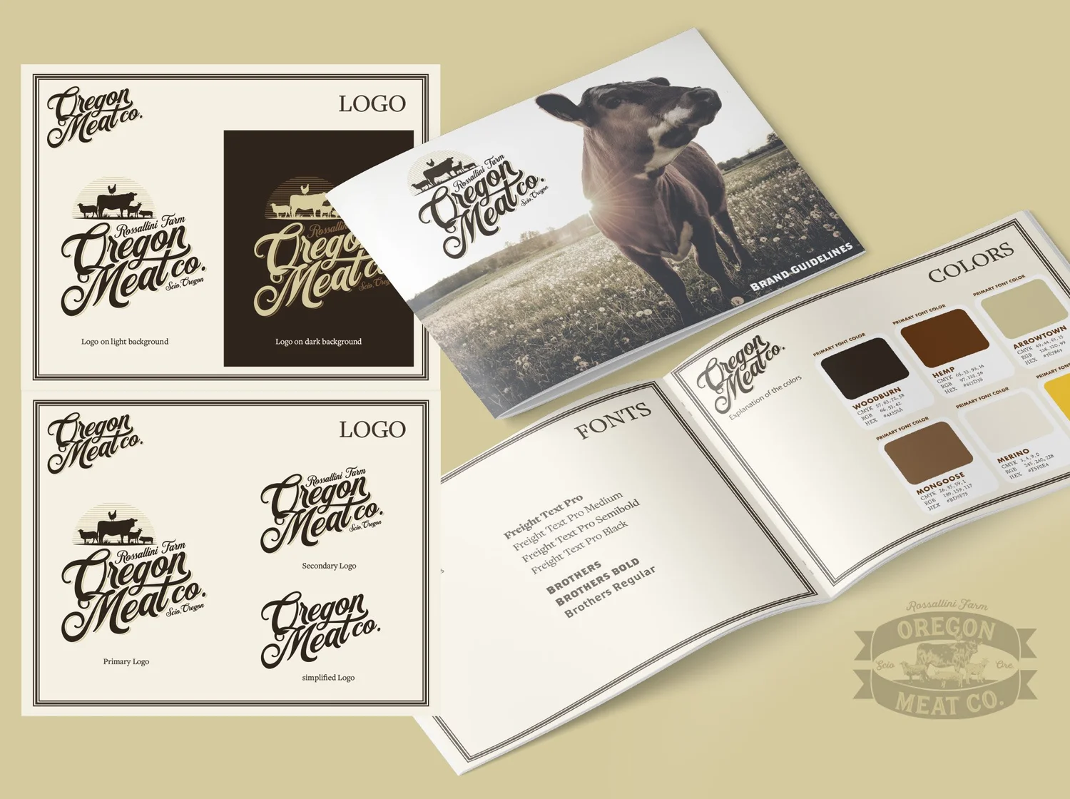
Built to stay consistent.
A small team needs a brand that holds together without a designer in the room. I put the system into a set of guidelines covering marks, color, type and usage, so the farm could produce menus, signage and labels that look like they came from the same place.
Their animals. Drawn by hand.
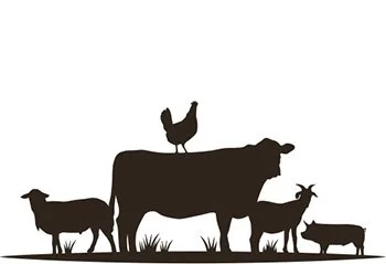
Rather than stock icons, I illustrated the farm’s actual livestock. Custom drawings make the brand specific to this farm and give customers a direct line to the animals and the place behind their food.
Premium you can see on the shelf.
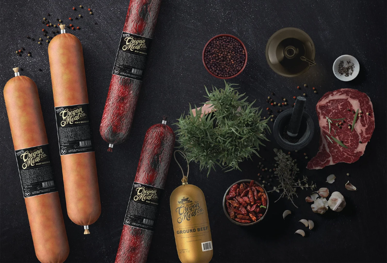
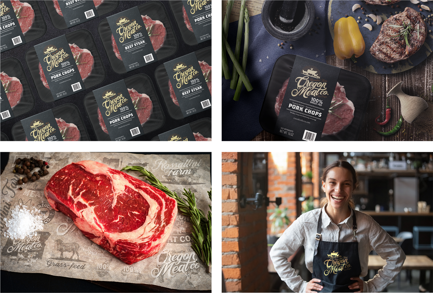
The illustrations and identity came together on the packaging. Clear, confident labels communicate the quality of the product at a glance and make each cut instantly recognizable as Oregon Meat Co.
“Making the decision to invest in branding for my small business ranks among the wisest choices I’ve ever made. A close second was teaming up with Nicholas Yarger and Wade Long at Manifest Creative.”Sarah Ballini-Ross · Owner, Oregon Meat Co.