COCONUT BLISS / BRAND REFRESH & PACKAGING
Simple ingredients.
Playful by nature.

A beloved non-dairy ice cream brand, refreshed through cut-paper illustration and packaging full of character.
The refreshed Coconut Bliss collection
01 / THE TRANSFORMATION
Fresh expression.
Familiar bliss.
MY CONTRIBUTION
Packaging design
Flavor illustration
Press check & production
CREATED AT
Revolution Design Group
The brief: refresh the packaging to communicate simple ingredients and great taste. At Revolution Design Group, we developed a playful cut-paper direction. I illustrated the flavor cues across the range and worked with the team on the press check before launch.

BEFORE
Original purple-and-gold Vanilla Island pint.
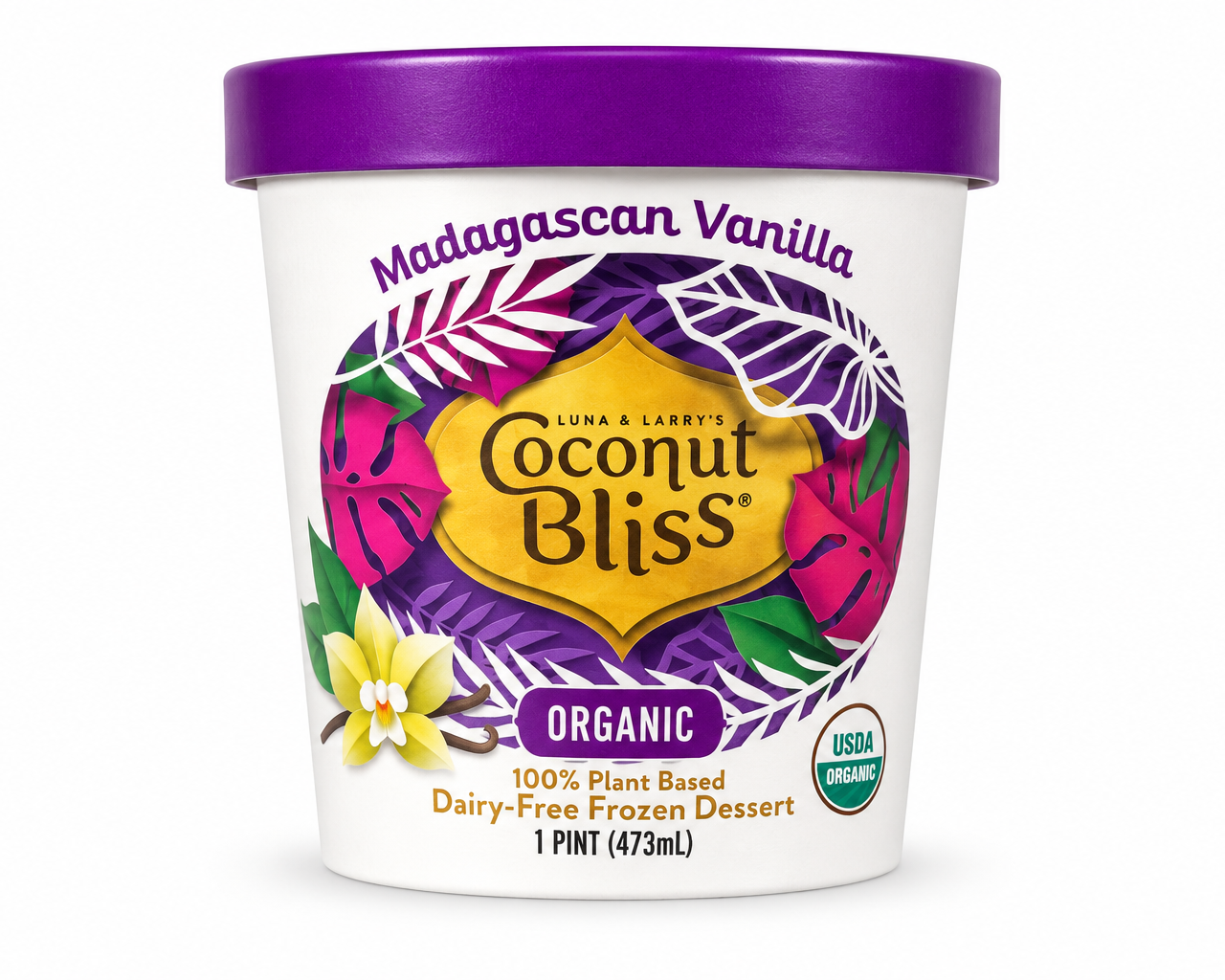
AFTER
Refreshed Madagascan Vanilla
02 / THE CREATIVE IDEA
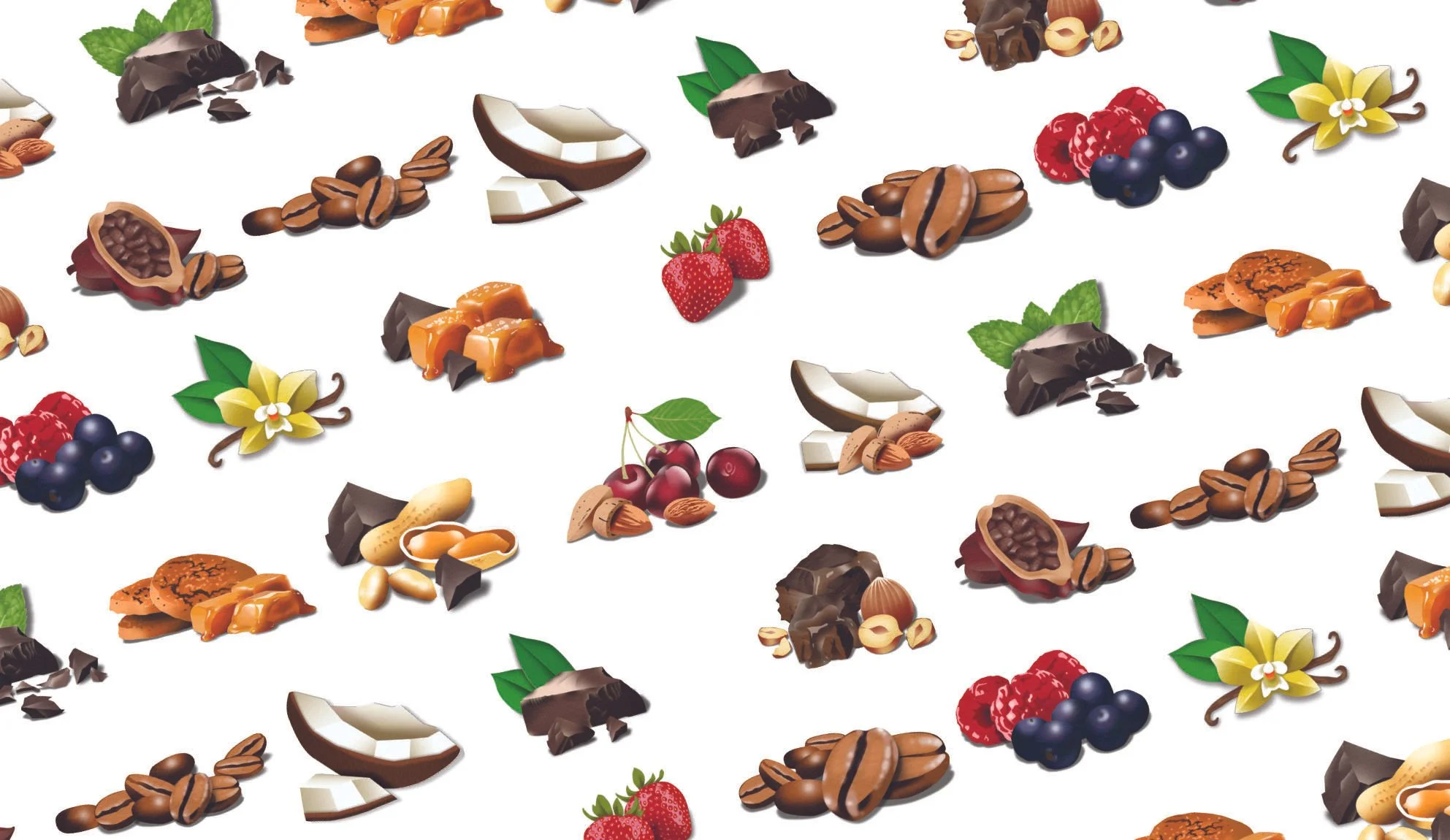
Layered paper shapes gave simple ingredients a playful expression. I built a library of flavor illustrations that could work individually and together.
Good things. Cut from paper.
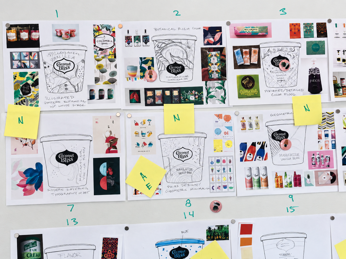
Direction / Packaging exploration
The craft / Ingredient illustration library
03 / THE COMPLETE RANGE
Many flavors. One family.

The three redesigned pints.

The boxed frozen treats.
Distinct colors and ingredient cues differentiate the flavors. The gold mark and botanical framework connect the range.
04 / BEYOND THE PACKAGE
A bigger world of bliss.
The packaging launch grew into a broader brand refresh. Our team’s work extended to trade shows, marketing materials, website design, social media, and photography.
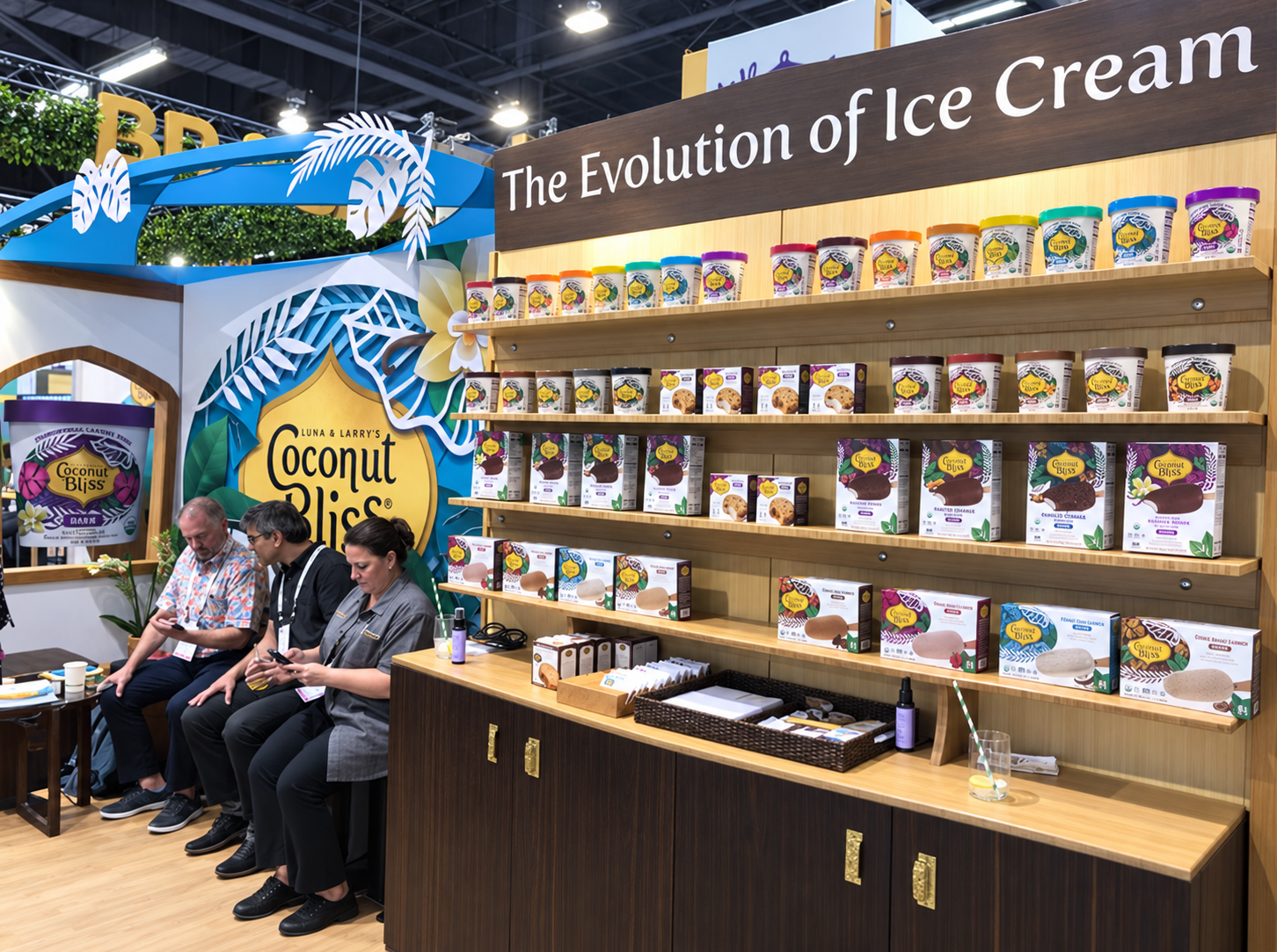
In person / Trade show expression

In print / Marketing and sales materials

Brand imagery / A moment of bliss
A little bliss.
Out in the world.
One creative idea, carried from the package into the wider brand experience.